Web scraping may not sound much like a traditional journalistic practice but, in fact, it is a valuable tool that can allow journalists to turn almost any website into a powerful source of data from which they can build and illustrate their stories. Demand for these kinds of skills is on the increase, and this guide will explain some of the different techniques that can be used to gather data through web scraping and how it can be used to fuel incisive data journalism.
Within this guide we will be taking a closer look at the basics of data journalism industry trends and how to get started with web scraping in order to craft stories with insight at the heart of the process alongside expert tips from our Co-Founder Kevin Sahin.
Introduction to Data Journalism
Data journalism is about using data to discover, understand, and tell better stories. You can spot new trends, debunk myths, and even give audiences more personal insight into why and how they might be affected by a story.
Within the media industry, award-winning data journalist Simon Rogers split the art of data journalism into five key types: data-based news stories, deep-dive investigations, fact-focused stories, local data storytelling, and analysis and background. These example methods have influenced groundbreaking news stories across the world.
Data journalism encompasses multiple skills - from web scraping data-rich websites or using more advanced spreadsheet features to knowing how to visualize data. However, not all data journalists will have or need every skill, but it’s important to understand the basic principles behind them and the possibilities they can unlock.
What Are the Key Aspects of Data Journalism?
From data to story, there are a range of aspects to consider across the journey.🔍
- Data collection: Obtaining data insights through different ways such as web scraping and downloading data sets from spreadsheets. As well as ensuring it is from a range of sources including government resources, organizations, public data sets, surveys, social media platforms, and UGC.
- Data hygiene: Before the analysis of data, it’s an important step to arrange a raw data clean-up in order to remove data inconsistencies or numerical errors.
- Data analysis: There are various methods that can be used for analysis in order to identify potential patterns or trends around a specific topic, e.g., data clustering.
- Data visualization: Visualizing insights, whether this be within charts, graphs, heatmaps, or interactive infographics can help to make data more accessible and engaging to readers.
- Storytelling: Bringing the story to life is the final piece of the puzzle. Through combining analysis and visualization, journalists can engage readers with unique credible content.
Is Data Journalism in Demand?
According to the Press Gazette, the first exploration into data journalism actually dates back to 1821 with The Guardian’s historic archives showing the origin of reporting on statistics. Nowadays, the news cycle appetite for data insights has skyrocketed and this can be connected to the increased sophistication of data analysis tools, greater wealth of data available to journalists, and the rise in data-driven storytelling to tackle ‘fake’ news.
It is now incredibly common for major news outlets to not only have specific data roles but whole teams focused on data journalism. There is a huge demand for reporting on insight across journalism to the point where there are even roles for data journalists in PR and marketing companies - a recent study by Cision showed that 68% of journalists want PR material to include data insight across a wide range of topics including economics, health, politics, and travel.
Analysing global search demand for web scraping skills over the last five years (using tools like Google Trends or our Google Trends API) also shows a major 53% increase in searches overall highlighting a rising appetite to learn about web scraping and data wrangling.
| Skill | Increase in Google Search Traffic (worldwide last 5 years) |
|---|---|
| web scraping | 104.62% |
| data visualization | 48.38% |
| data analysis | 60.66% |
| machine learning | 45.78% |
| data wrangling | 114.92% |
| Total | 53.11% |
What Are the Benefits of Data Journalism?
The ‘data-driven revolution’ has had a major impact on journalism across the world with insight increasingly taking centre stage across emerging press stories. Let’s break down five major benefits of infusing data analysis into journalism 🔍
- Media trust: Trust in news publishers has seen a decline in recent years however data journalism can support building trust with audiences. Providing accurate fact-checked stories which take on the form of exposé content can drive trust.
- Empowering audiences: Data journalism enables readers to be equipped with a wealth of credible information helping them to be more informed and to have a deeper understanding of complex global issues.
- Impactful storytelling: The use of data in reporting can create a greater impact on readers and ultimately help to make a difference. This is particularly the case for stories which visualize data in engaging methods to enhance readability.
- Trend spotting: Data analysis can lead to uncovering trends and patterns across a range of industries opening the door to writing about deep-dive investigations.
- Driving Positive Change: Ultimately the core goal of data-driven storytelling is to ignite powerful change and it can help to support tackling global issues such as sustainability, health movements, and economic crises.
Data Journalism Examples
Now that we’ve explored data journalism basics and the benefits, we’ve curated our favourite examples of powerful data-driven storytelling put into practice 😍
Examples of Impactful Data-Driven Storytelling
Humans Are Biased: Generative AI Is Even Worse | Bloomberg
This masterful storytelling demonstrates the inherent bias to white males in the image generation tool Stable Diffusion. From over 5000 image generations, lighter-skinned people were more associated with higher-paying jobs while people with darker skin tones featured in prompts with words like "fast-food worker" and "social worker".Tracking The Health Of Our High Streets | DC Thompson
This impactful report examines the effect of lockdowns, recessions, and the rise of online shopping on the Dundee retail scene. The piece contrasts the varying fortunes of the city's 11 high streets, blending motion graphics, 3D walkthroughs, charts, and overlays with quotes from local independent shop owners sharing stories of how their businesses have fared over time.The Unlikely Odds Of Making It Big On TikTok | The Pudding
In this piece, the authors searched for hard evidence that TikTok could launch an artist's music career. They found that 25% of the 332 emerging artists who charted on Spotify for the first time came from TikTok. This well-argued article concluded that TikTok is changing how music is consumed but TikTok virality is not a guarantee of success for an emerging artist.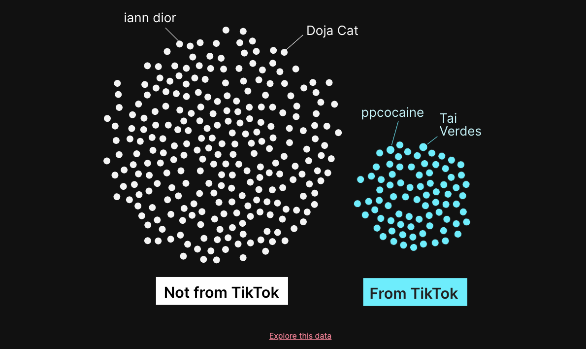
Check out our in depth guide on How to scrape Tiktok
Viewing The 2024 Solar Eclipse Through A STR Lens | AirDNA
A total solar eclipse was seen on the 8th of April across North America with the cosmic phenomenon driving tens of millions of people to experience the event first-hand. For this example, the global leader in short term rental intelligence AirDNA undertook a unique data-driven investigation into the impact of the solar eclipse on STR demand, visualising an incredible 88% occupancy rate surge. The report also visualized the journeys of eclipse watchers from more remote locations across the country to the urban hotspots along the path of the solar eclipse.Mapping Which Countries Joke The Most | ScrapingBee
Our very own ScrapingBee team conducted an AI analysis to understand what countries are trying the hardest to have a sense of humour on Reddit. Firstly, we utilized the Reddit API to collate this year’s top 50 threads from each nation’s subreddit and then we used AI to classify the top comments as ‘joke’ or ‘not joke’. Covering 352686 comments from 9969 threads, we then analysed classifications for a range of insights. So what did the results uncover? According to our research, Australia, the USA, and Germany are the three most humorous nations on Reddit, with Scotland and Ireland supporting the most attempted jokes in contrast. For more information on the methods used and getting RAW data from Reddit API utilizing PRAW, view our AI and the Art Of Reddit Humour piece.
Examples of Everyday Data-Driven Storytelling
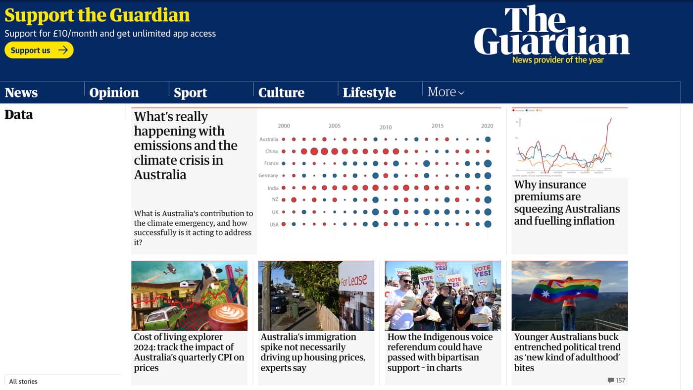
The Guardian | Data
The Data section of The Guardian website contains many stories across a wide variety of topics that use striking and easy-to-understand graphs, charts, and tables, many of which are interactive.![The-Guardian]()
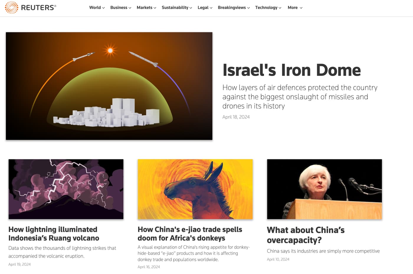
Reuters | Graphics
The Graphics section of the Reuters news agency website uses graphs, charts, heat maps, overlays, and more to help reporters communicate the key points of the situation they're reporting or the argument they're conveying. There is a wide selection of reportage too, from financial data to election results.![Reuters]()
Financial Times | Visual and Data Journalism
The Financial Times' Visual and Data Journalism section is a prime example of how an online publication can make its storytelling and reporting more compelling with strong and clear visuals. The paper's journalists and designers skillfully use a range of visual aids to easily explain complex information.
Reddit | Data is Beautiful
Reddit is also a goldmine for data visualization inspiration, particularly the popular open discussion thread r/dataisbeautiful. Followed by 21M Reddit members and counting, this is a community for sharing aesthetically-pleasing visualizations which clearly convey a powerful message.
What is New and Trending in Data Journalism?
The dynamic nature of the news cycle means that there are often new data journalism trends on the block, and in a new world of generative AI, it’s important to keep your finger on the pulse of emerging trends. According to our research, the following data journalism methods will be major in 2024 🔥
- Web scraping: Scraping sites across the World Wide Web is an increasingly popular method to obtain data and particularly the use of web scraping tools such as ScrapingBee API to access data quickly and to monitor topical keywords.
- Gen AI insights: It’s no secret that the power of generative AI has been taking the data journalism world by storm, with journalists being able to tackle big data sets at scale and speedily uncover an extra layer of analysis.
- Social media expansion: Bringing data-driven stories to life on social media apps, particularly TikTok, is a major growth area for data journalism in order to reach younger audiences, with Gen Z being twice as likely to consume news through TikTok.
- Data journalism training: The rising demand for data-driven skills in journalism correlates with higher opportunities for training. From AI in the newsroom and sourcing local data to investigating spreadsheets and turning data into shareable visual snippets.
Web Scraping for Journalism
ℹ️ We have a lovely article dedicated to what is web scraping? Please feel free to check it out should you wish to learn more about web scraping, how it differs from web crawling, and a comprehensive list of examples, use cases, and technologies.
Why Should Journalists Use Web Scraping?
Before you can do anything with data, you generally need it in a usable structured form. And the web is a great source of rich data. In a nutshell 🥜, web scraping enables journalists to extract complex information from a range of websites to provide a strong foundation for an article.
Say you want to discover the most eco-friendly Airbnbs within your area ahead of Earth Hour. Without a web scraping tool, the process of identifying Airbnb listings with the green stamp credentials would be highly manual, racking up time to get to the story.
Thanks to web scraping, you can use Python, BeautifulSoup, or ScrapingBee to scrape Airbnb listing data and uncover the leading sustainable spots near you to form an engaging local story which can inspire travel enthusiasts to switch to greener accommodation options.
Web scraping allows you to use a simplified structure to automatically retrieve data in a usable form, completing what might have been hours or days of manual work in minutes or seconds.
💬 Quote from our Co-Founder, Kevin Sahin:
Journalists should learn how the web works. Learning Python is a secret weapon in order to learn how to scrape the web. Thanks to its rich ecosystem, web scraping has never been so easy. Web scraping framework, data manipulation and visualization libraries, you name it!*
Choosing the Right Web Scraping Tool
The right tool for a task depends on both a data journalist’s own level of skill and the complexity of the task.
💡 If you’re interested in learning more about the wide range of web scraping tools in the market we have recently written about the best web scraping tools for 2024.
No-Code Tools
You don’t have to have a huge amount of technical knowledge to use web scraping - Google Sheets for example has some basic tools that can help you extract data from a web page.
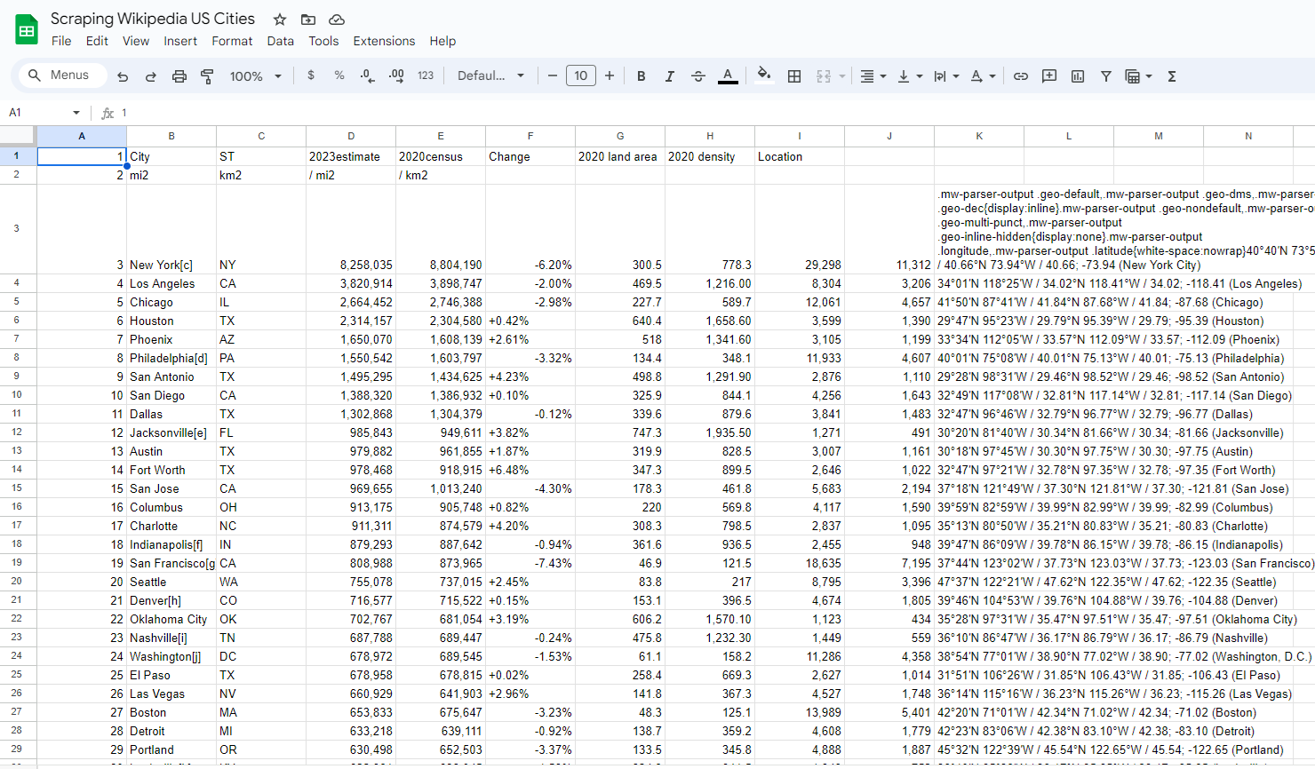
Want to quickly see the population of US cities according to Wikipedia? Create a new sheet and enter the following formula into a cell:
=IMPORTHTML
And you should see the data from this Wikipedia page converted into a spreadsheet. Our team has scraped Wikipedia’s population of US cities to show the spreadsheet example brought to life.
Scripting Tools
For more advanced web scraping tasks, you might want to learn a little bit more about how web pages are structured and also the basics of a programming language that will let you write a script to pull the data you want. Beautiful Soup is a library for the popular programming language Python that allows you to write scripts that break down the underlying HTML code behind web pages and transform it into useful data.
Being able to automate scraping tasks in this way means you can gather data from a website even if it’s spread across hundreds or thousands of different pages. You could also set up a task to check how data changes over time - writing a script to check a public transport website to see how often services show delays.
But unfortunately, HTML code doesn’t always contain everything you need - some websites build their content ‘on the fly’ - you might have a table with the first 10 rows of data with a ‘next’ button that loads in more without navigating to a separate page. This doesn’t mean you can’t scrape it as there are tools that can simulate user navigation and process the data automatically - Selenium is a popular tool for this.
Another common issue you’ll run into is that some websites would prefer that their contents weren’t accessed via automated processes - if you make too many requests over a short period they may block you from accessing them or require you to complete a manual ‘prove you are human’ process. There are tools that help you work around this by e.g., using proxy servers that make it look like your requests are actually coming from different users - our web scraping API can handle multiple aspects of this for you eliminating a lot of potential headaches.
💬 Quote from our Co-Founder, Kevin Sahin:
For beginners, I would recommend to use the ImportHTML function inside Google sheets as a start and the Dataminer Chrome extension. For intermediate users, I would try using our webscraping API and tools like Parsehub. Advanced users should try frameworks like Scrapy and headless browsers like Playwright.
Data Analysis and Visualization
Once you’ve got your data, how can you bring it to life to capture a reader's attention? 👀
At the most basic level, importing it into Google Sheets or Excel will let you perform some basic analysis - you can even visualize insights by transforming them into different chart types and graphs.
If you’ve scraped geographic data (e.g., the latitude and longitude of a set of places) you could even import it into Google Maps and display your findings that way.
Beyond that, free tools like Tableau Public and Canva can enable more complex visualizations without the need for a Graphic Designer, allowing you to integrate data and graphics into a wide variety of charts and maps. The Pudding is an industry-leading example of going the extra mile with data visualization to captivate readers.
Storytelling with Data
Once you’ve got your data, you could just present your audience with a bunch of tables and charts and hope for the best, but ideally you want to use your data to tell them a story. Here are some principles to keep in mind 💡
- Pull out the key takeaways: Which place has the most X? Which car manufacturer has the most improved Y? Which industry has lost the most Z? Identify the most impressive or the most surprising bits of data to show your audience the highlights which have emerged from the research.
- Provide and understand the context to the data: Has something changed? Look at why it’s changed. If a statistic has increased, is the increase more or less than what would be expected given everything else that’s going on?
- Think about different ways of presenting the same statistics: When talking about headline stats it may be clearer to say that 1 in 3 people hate cheese rather than saying 33% of people hate cheese. Or maybe it’s more impactful to say X million Parisians hate cheese!
- Let your audience explore: Once you’ve highlighted what you think are the key parts of your story, you might want to think about how your audience might engage with the parts of it that are relevant to them. If you’re telling a story about how healthcare funding varies in different parts of a country, you might want to give your readers a chance to dig into the place they live and see specific stats relevant to them.
Data Visualization - Avoid Traps
- Don’t mislead by cropping a graph to the ‘interesting bit’: Don’t misrepresent data by starting a graph halfway up an axis as it makes the data points look much further apart than they actually are. Similarly, be careful about where you stop the axis - if you’re showing percentages, you should avoid unintentionally suggesting that the biggest bar on a graph represents 100%.
- Be careful about using Pie charts: Though very popular, they’re difficult to read if they contain more than a few data points or if the data points are very close together.
- Be careful about fancy but overly complex presentation: A 3-dimensional graph may be harder to read and adding ‘perspective’ may make it harder to decipher which element of a graph is the biggest.
Ethical Storytelling with Data
When telling stories with data, it’s important to make sure the data you’re using actually tells the story you think it does.
- Use trustworthy sources: Get data from reputable sources that themselves explain where the data they’re using comes from. If it’s not clear where their figures are from, you can’t be confident that anything you do with them will be correct. Credit all your sources and explain any additional calculations you’ve done.
- Be clear when the data is from: Should the reader bear in mind that the data is a few years old? You should note any important historical context, e.g., if using data from the year 2020 you may wish to include a caveat that the Covid 19 pandemic may have had an impact.
- Make sure your figures are comparable: If you’re comparing two different cities you may want to factor in differences in population (i.e., present the data per capita) or the size of the physical area (i.e., present the data per square mile). If you’re using data from multiple sources ensure they use the same definitions - a source that defines a city as ‘everything in a 5-mile radius of the city centre’ may not be comparable with one that defines it using the actual city limits.
Advanced Techniques
In some cases, data that isn’t available or easily scrapable via a website may be available via an API (Application Programming Interface). This essentially cuts out the middleman by providing you with data that is designed to be digested and processed and works by providing a structured and labelled feed generally with a corresponding set of documentation explaining what each line of data in the feed means.
For example, OpenMeteo provides forecast and history weather data - if you needed to compare the temperature in a set of locations you could write some code to request data for each location in turn, then extract the temperature value returned in the response to each of your requests.
Sources of Data
There’s a lot of freely available data online or available by request - here are a few types of sources to get you started 🥳
- Governments and public bodies: Governments often have specific departments or organisations that provide data on a variety of topics in various formats (e.g., the Census Bureau in the USA, the Office for National Statistics in the UK). Individual government departments and other public bodies may collect and publish data on topics relevant to them. (e.g., the UK police publish crime data for England, Wales, and Northern Ireland).
- FOI requests: You may also be able to file Freedom of Information requests with public bodies though they do not necessarily have to respond to overly complex/costly requests and getting data at a national level can involve contacting a large number of more local organisations.
- Geographical data: OpenStreetMap has an API that can allow you to retrieve many different kinds of geographic information though it does require some technical knowledge.
- Public APIs: Public APIs are available across a range of verticals to dive deeper into topics with popular examples including the SoundCloud API to discover music from emerging artists and Food API to analyze thousands of recipes and food products.
Want to Try ScrapingBee API?
If you are interested in getting started with web scraping for journalism and scraping sites at speed and scale to develop cutting-edge stories then give ScrapingBee a try.
Start your web scraping exploration with 1000 free API calls and no credit card required by signing up for ScrapingBee. Supercharge your stories with web scraping ⚡️We have a top-tier support team ready to assist you in acquiring the exact data you need through web scraping.
💬 Quote from our Co-Founder, Kevin Sahin:
ScrapingBee allows data journalists to focus on extracting data, not deploying headless browsers on a server or think about managing proxies. For example, let’s say you run an article about E-commerce website manipulating prices during black Friday (displaying an article as being on sale, where in reality it’s not). Most international E-commerce websites are displaying pricing information based on your IP address. You will need an European IP address to get the pricing in Euros, or a US-based IP address to get the pricing data in dollars. By using ScrapingBee, you don’t have to manage proxies, you can geo-locate your request in any country with a simple API parameter. The other advantage is that you don’t have to handle headless browser to render the page, we do that for you.
Happy scraping from ScrapingBee!
Before you go, check out these related reads: